
What are the different styles of hangul scripts?
Hangul scripts have seen some changes over the years from the traditional styles of the Joseon court to modern computer fonts! So as Hangul Day (Oct 9) approaches, let’s look at some different styles of hangul scripts.
In this post find out about the characteristics of two traditional styles as well as some modern hangul typography scripts.
TRADITIONAL SCRIPTS
Traditionally, there were two distinctive hangul styles: Go-che (old style) and Gong-che (palace style)
Go-che was designed for printing (also known as pan-bon-che 판본체) So it was used for wood-block and movable metal type printing. Kings and governments had variations of this print style made in metal types for publications throughout the Joseon period.
Gung-che was developed for handwriting with a brush. It was more elegant and delicate and the ladies in the Joseon Royal Court wrote in this style. Gung-che also has a cursive version.
GOCHE 고체 ‘OLD STYLE’
For an example of old style, here’s the work (vertical from right to left) of famous calligrapher Kim Choong Hyun:

Kim Choong Hyun 김충현 (1921-2006) (pen name: Iljoong) is the most famous calligrapher of hangul who developed the print script into his own 고체 goche style. I like this style where the brush mimics wood block printing.
Although modern Korean is written horizontally from left to right like English, at first it was written vertically from right to left like Chinese and Japanese. But today, for artistic purposes it can be written either vertically or horizontally!
The strokes are a similar thickness from start to finish and the shorter strokes can be written as actual strokes (below left) or as dots (below right).
Related posts:
The work of Kim Choong Hyun appears in the book on Korean calligraphy Beyond Line: The Art of Korean Writing

Actually, each stroke is done in several movements creating adorable wobbly strokes like the carvings in a wood block print.
And after learning both hangul and hanmun (Chinese characters) calligraphy, I can really feel the difference between the two. The calligrapher has to be more delicate writing hangul!
So that’s one of the reasons it’s known as a script for ladies! And because hanmun and hangul are very different, calligraphers usually excel in one, not both.
However, Kim Choong Hyun is unusual as he’s famous for both hangul and hanmun. And the Baegak Gallery in Insadong has a hall and permanent exhibition dedicated to his work.

COMBINING CHINESE CHARACTERS & HANGUL: Hon Seo 혼서
Up until fairly recently, Korean official documents and newspapers were printed in a combination of hangul and Chinese characters. But this trend is dying out now and hangul has taken over.
Still, in calligraphy art, combining the two types of character can look rather stylish. (That’s what I’d like to be able to do one day…)
Here’s an example from Kim Choong Hyun’s textbook where he combines hangul and hanmun, known as hon-seo-che

HUNMIN-JEONGEUM
Back in the day, the first book written to introduce the new hangul script in the 15th century was the Hunmin-jeongeum. It’s in a combination of hangul and Chinese characters but not for aesthetic purposes. The reason was very practical: NOBODY could read hangul, so they needed an explanation!
So in this case, each hangul character was followed by an explanation in Chinese characters. That way, the aristocrats could learn how to pronounce the new letters.
In this style, the shorter hangul strokes are written as dots.

Meanwhile, in everyday life in the Joseon period, people used brushes for writing. And so by the 17th century, a more flowy style developed:
And these dainty strokes became known as Gung-che Palace Style.
GUNG-CHE 궁체 PALACE STYLE
And as hangul was a script for ladies, it’s fitting to look at the work of Lee Mi Migyeong (1918- ), a famous hangul calligrapher in the gungche Palace Style.

HANGUL, A SCRIPT FOR WOMEN
When hangul was first created, most of the population was illiterate and commoners didn’t have the time or resources to learn thousands of Chinese characters. Only aristocratic men were literate. And the ruling elite weren’t keen to adopt the new simple writing system.
So at first, hangul became know as ‘women’s letters’ as it was used by the ladies in the royal court.
Here’s an example of how to write the characters from Lee Mi Gyeong’s textbook.

Palace style was used by the court ladies (known as seosa-sanggung) who were in charge of copying documents. The strokes are gentle and elegantly taper off into a point like a ballet dancer on tip toes. You need a delicate hand to write these characters!
CURSIVE PALACE STYLE
Eventually, a cursive palace script developed too which was faster to write and could showcase the writer’s personality more freely.

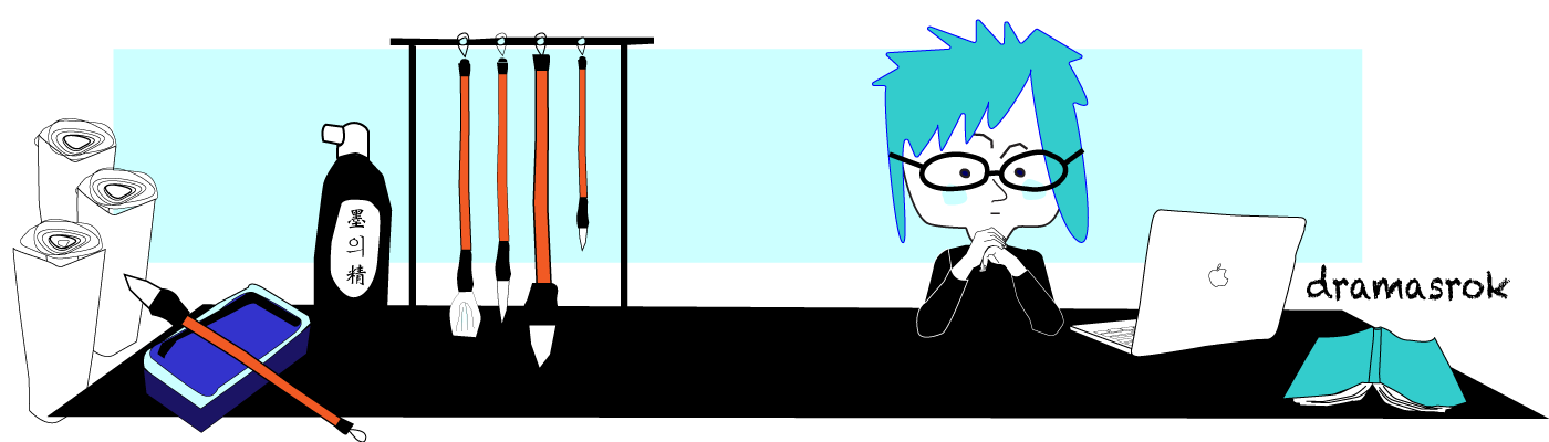
See more dramasrok posts and pictures from Korea on Facebook and Instagram
OTHER HANGUL STYLES
Up to now we’ve looked at the Goche old style and Gungche palace styles which are traditional hangul scripts. If anyone wants to write in these styles they have to follow rules about stroke and form and make sure each character fits nicely into a square.
As a result, traditional calligraphy isn’t so popular in Korea anymore. It’s slow, it takes ages to get any good, and there are too many rules to follow! So another camp of calligraphy has appeared:
Modern calligraphy.
Instead of following rules, modern calligraphy hangul styles are more playful and free. It’s about being creative and showing your personality through the strokes and shapes of the character.

In the top picture, the word 복 (fortune/luck) changes shape as it’s squeezed into chubby square or a tall, elongated box. (Below that is a more traditional approach with a square). The angle of the letters can be manipulated too – leaning in different directions for a quirky look.
Modern calligraphy aims for creativity and self-expression and makes its own rules. It’s about playing with the shape and thickness of the strokes to invoke an image or feeling – like making the word for chicken (닭) look like a chicken:

These images were taken from the Korean book How to write calligraphy easily 캘리그라피 쉽게 배우기)
TYPOGRAPHY
Since computers have taken over our lives, lots of modern hangul fonts have appeared. The most famous typographer is Ahn Sang Soo (1952 – ) a pioneer in Korean typography.
He has worked with hangul for over 30 years experimenting in letter font design, typography, editorial design, logo type design, poster production, wall installation, letter performance, letter work, silk screen, and ceramic tiles!
After he began to experiment with font he founded Ahn Graphics, a design firm. Read more about the work of Ahn Sang Soo.
I like the traditional and the modern calligraphy scripts. Sometimes it’s good to follow rules and other times maybe we just want to experiment and be creative. So I want to practise both!
See more dramasrok posts and pictures from Korea on Facebook and Instagram
Related reads:
Beyond Line: The Art of Korean Writing


Beautiful!